The Gyst (re-brand)
Branding and Stationery
Client:
I joined The Gyst full-time at the end of January 2023, after spending several months looking for a new role following my redundancy from RS Connect during their company-wide restructure. The opportunity came when the Managing Director, Phil, reached out after being given my name by his printer, who knew I was looking for a creative position. In our initial conversation, Phil described The Gyst as a “small advertising agency punching well above its weight”, with a diverse client base and a heavy focus on work for Triumph Motorcycles. The agency had also previously handled projects for brands such as Harley-Davidson and Ducati.
Brief:
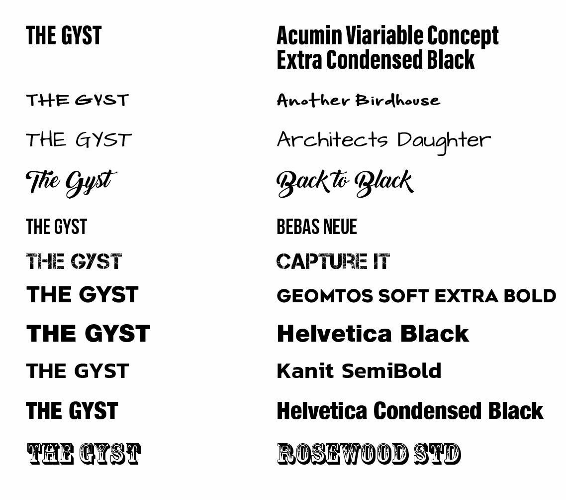
A little over a month after joining The Gyst, I was asked to explore a refresh of the company’s existing logo. I approached the brief with a structured discovery phase, reviewing the brand’s positioning and typographic direction. From this, I shortlisted a selection of typefaces that aligned with the brand’s tone of voice and the creative considerations outlined during discussions. This formed the foundation for the initial concept development that followed.
Typography Exploration
IDEA Exploration
I then moved into an exploratory concept session with the Managing Director, where we discussed potential creative directions. He expressed interest in seeing options inspired by woodcut-style artwork as well as concepts incorporating cog motifs. Using these prompts, I began developing a range of early visual ideas to test how these themes could translate into a refreshed brand identity.
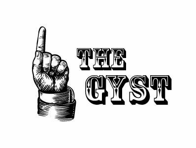
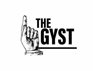
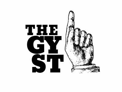
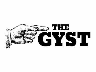
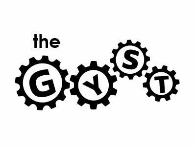
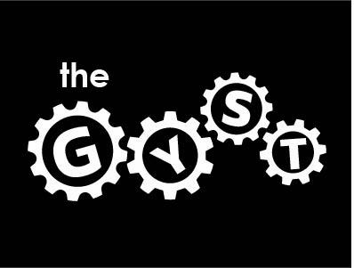
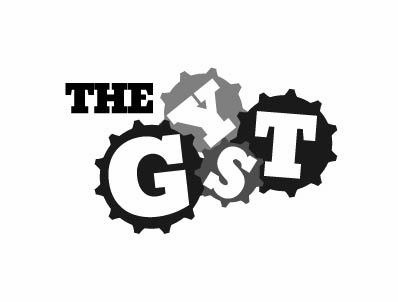
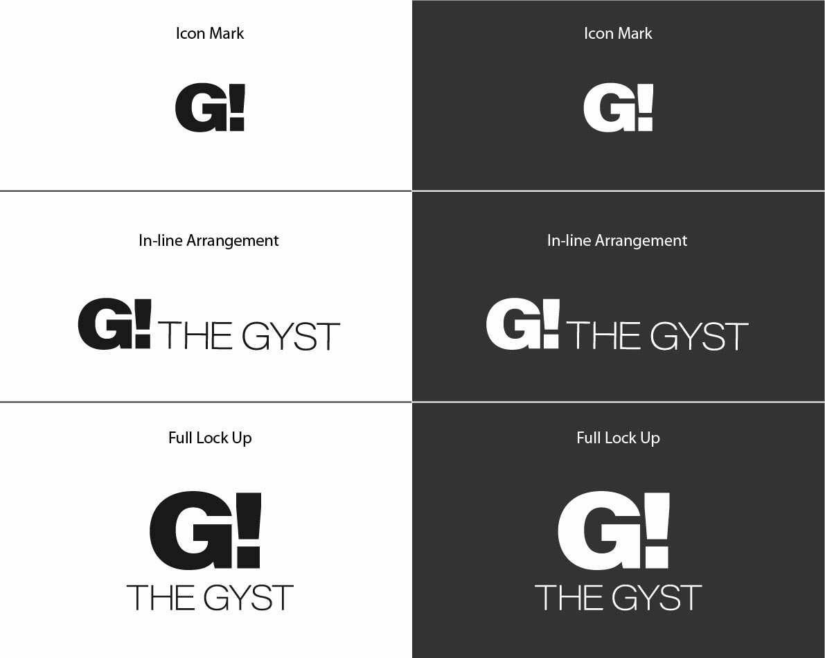
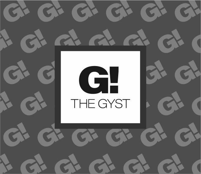
We ended up discarding these early concepts in favour of a completely typographical solution:
Stationery:
With the logo decided upon, I implemented them into the company stationery.
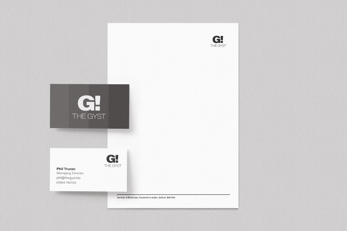
The Gyst letterhead and business card
